LIFTxT: a gym tracker for a man who can't read his own gym tracker
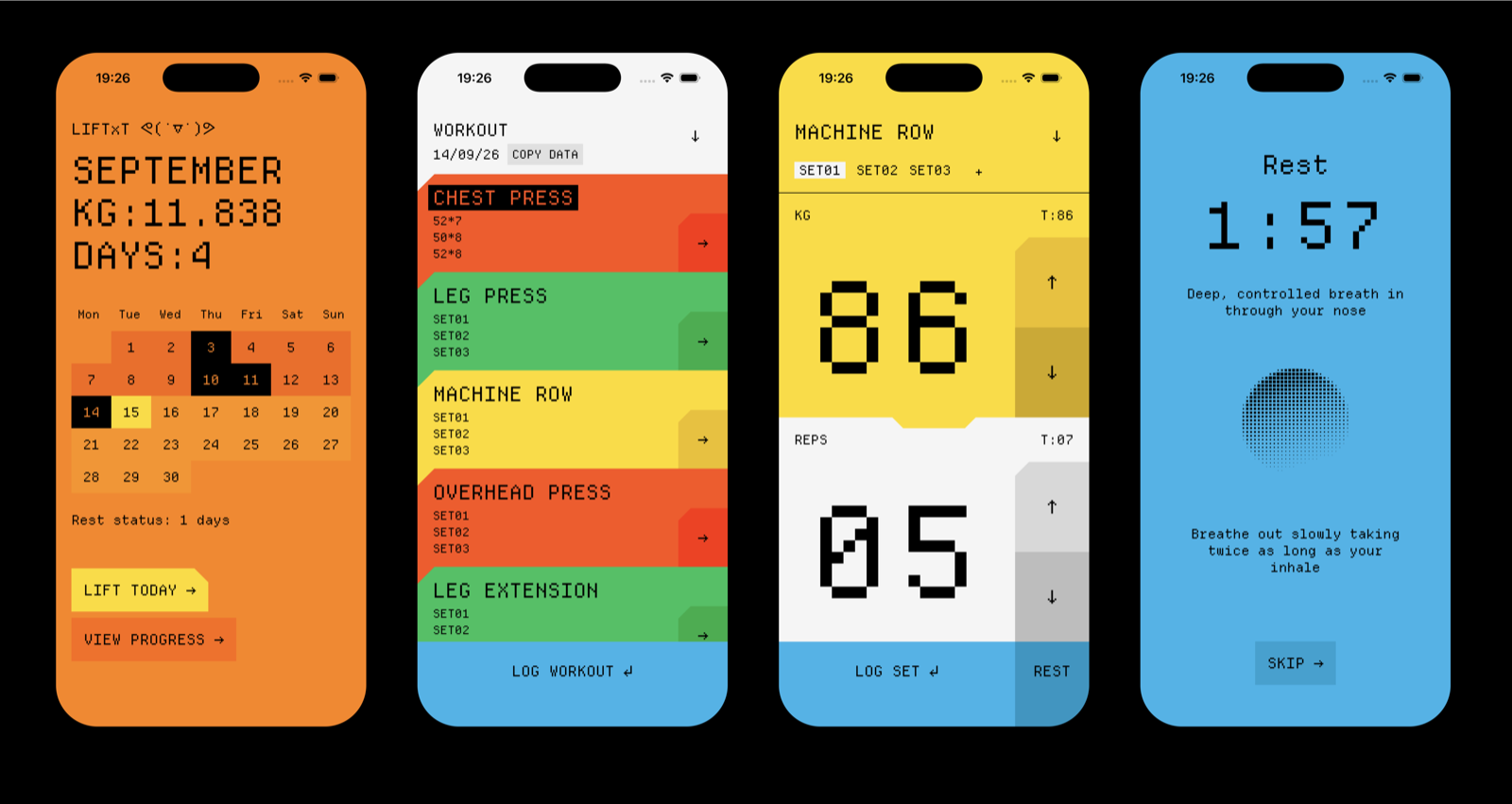
My most recent adventure with Claude Code is a personal app to help me track my workouts in the gym.
It started, like most useful things do, from an annoying problem: I’m a proper middle-aged man now, which means presbyopia has caught up with me, and I basically can’t see anything at close range without reading glasses. Every fitness app I tried was unusable mid-workout unless I stopped, dug my glasses out, and squinted at 12pt numbers on a rep counter. Not exactly a minor UX complaint. More a “this app doesn’t work for me at all” problem, and it hits exactly when I’m least willing to fuss with anything: mid-set, trying to keep momentum.
So the brief I gave myself was almost stupidly simple: huge numbers, huge buttons, nothing else allowed to get in the way. That rule sorted out how the app looks. It doesn’t explain how the app thinks, though, and thinking turned out to be the harder, more interesting problem. That’s the one I actually want to get into here.
The workout the app actually had to understand
I don’t train with a fixed number of sets at a fixed weight. I train in a reverse pyramid: the first set of an exercise is the heaviest weight of the day, taken to genuine failure, as many reps as I’ve got left. Every set after that is lighter, because by set two I’m not the same lifter I was ninety seconds earlier. Sometimes there’s a fourth, lighter “burnout” set on top.
Reverse pyramid training isn’t a novel idea, it’s a known, standard approach. Almost no fitness app is built around it, though. Most assume you pick one weight and chase reps upward across identical sets, or that you’re following a program with every number decided weeks in advance. Reverse pyramid doesn’t work like that. The only number that matters going in is set one’s weight, everything after it is a judgment call made under fatigue, mid-session, with no time to think it over.
That’s the gap I’ve never seen a tracking app actually close. Closing it turned out to be the real design brief here, more than any single screen. The eyesight problem picked the visual language. The training style picked the logic, and the logic is where the fun decisions were.
Not the typography. Not the zoom transition. The actual design problem of this app was the number sitting above set one when you walk up to a machine.
Version one was too simple to be useful, on purpose
I built the first version of the target logic almost embarrassingly basic, deliberately, so I’d have something real to react to before trying to be clever about it:
- Hit 8 or more reps on set one? Too easy: add 2.5kg next time.
- Come in under a threshold? Take 2.5kg off.
- Land in between? Hold the weight and chase one more rep.
Sets two and three just recalled whatever I’d logged in that slot last time. No math at all.
It produced a number. It didn’t understand a thing about training, and Machine Row is where that fell apart first. I’d stalled there, same weight, reps not climbing, three sessions running. The app kept cheerfully suggesting I hold and chase one more rep, because a single-session rule has no memory. It can’t tell a normal off day from a genuine plateau if it’s only ever looking at the most recent number. A real coach would have clocked the trend by session two. So that’s what I gave the app: look at the last three sessions, and if the weight hasn’t moved and the reps are flat or sliding backward, call it a stall and drop the weight instead of asking me to keep failing at the same number forever.
The second problem was quieter but bugged me more once I noticed it: the step size was symmetric. Add 2.5kg on a win, subtract 2.5kg on a stall, tidy on paper, wrong in the gym. If a weight’s genuinely stalled for three sessions, dropping by the same amount you’d gain on a good day just puts you right back at a weight you’ll probably stall at again almost immediately. Real coaching drops further than it climbs, so there’s room to string a few winning sessions together before you’re back at the same ceiling. So the rule became asymmetric on purpose: +2.5kg on a win, −5kg on a stall. It’s also the one part of this whole system that’s a straight lift from actual coaching practice, not something I made up for the app.
Drop further than you climb, so there’s room to string a few winning sessions together before you hit the same ceiling again.
Sets two and three don’t get their own rules, they get a memory
Set one’s target is one clean number. Sets two and three are trickier, because their whole point is to be lighter than set one, by an amount I decide by feel on the day. Not something an app should be inventing.
Version one just parroted back whatever I’d logged in that slot last session, no relationship to set one at all. Fine, until the day set one’s weight actually changed. Say set one climbs from 80kg to 82.5kg. Set two, frozen at whatever I did last time, is suddenly measuring the wrong gap, it hasn’t moved, even though the set it’s meant to be a fatigue-adjusted step down from just did.
What actually matters for set two isn’t the raw number I lifted last time, it’s the gap between set one and set two on the day. That gap is still mine to choose, machine plates and all, the app has no business inventing a drop-off formula. But it can remember the gap I used last time and reapply it to today’s new set-one number, so set two moves sensibly instead of quietly going stale. And because that gap is really just a smaller echo of the same story, too easy or stalling, it gets the same two rules set one gets, scaled down.
Writing all four rules out as plain sentences, before a line of Swift existed, mattered more than I expected. A training decision that lives entirely in someone’s head can’t become code until it survives being written down precisely enough to argue with.
Showing your work
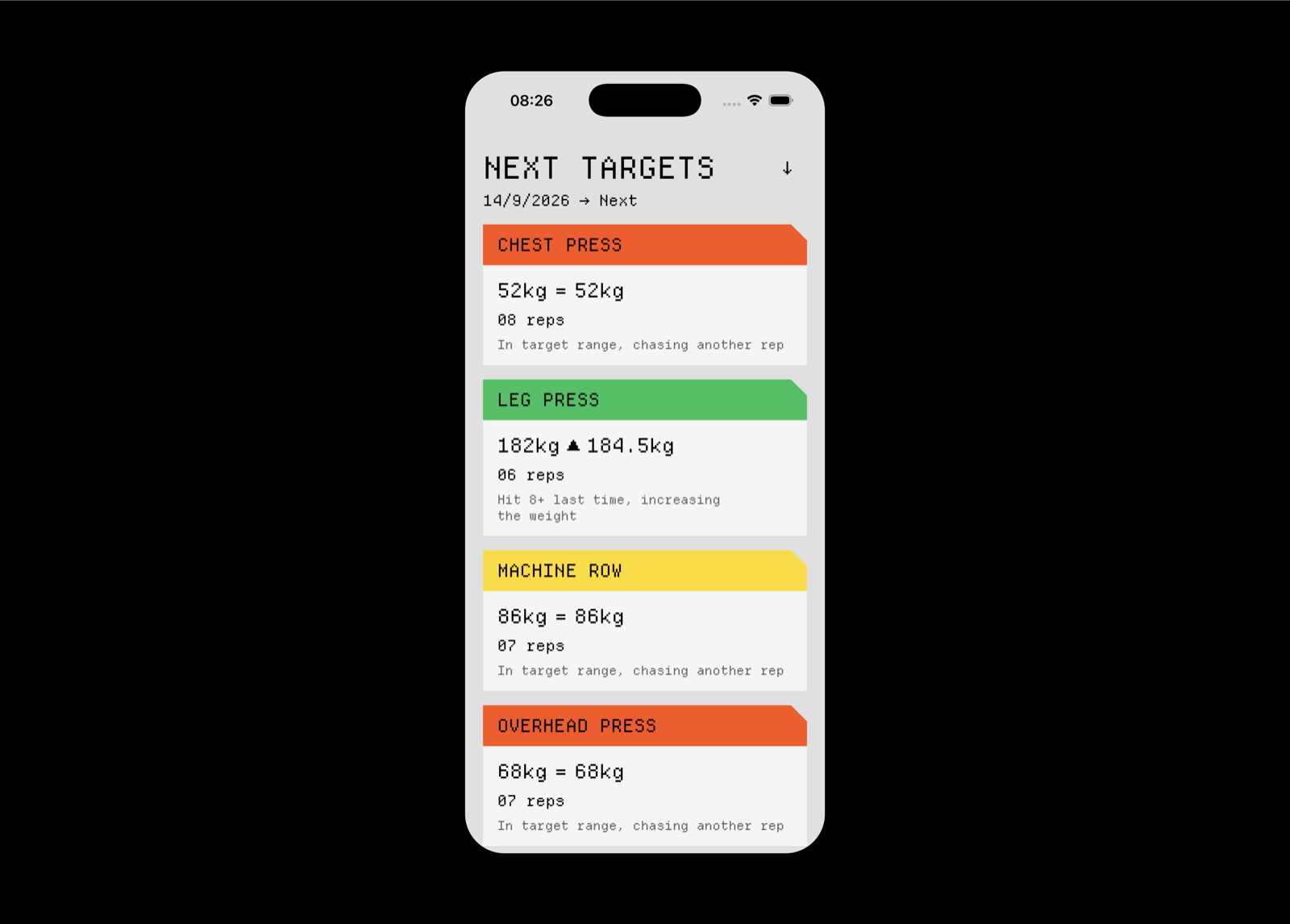
All of this used to be invisible. A number would just appear above a set with no explanation. Trusting a recommendation you can’t interrogate is a bad habit to build into a tool for something as physical as lifting, so the app now shows the reason next to every target, pulled from the same code that computed the number rather than a separately written guess that could quietly drift out of sync. “Stalled the last few sessions, dropping the weight.” “Hit 8+ last time, increasing the weight.” “In target range, chasing another rep.” If the number looks wrong, the sentence next to it tells you exactly why it thinks that.
That also gave me an excuse to add the screen I’d wanted from day one: a single glanceable view of every exercise’s next target, before I’ve touched a single machine. Not a chart, not a history. Eight lines telling me what today’s plan is and why, so I walk in already knowing the number instead of finding out one exercise at a time.
Sketching before writing a line of code
I didn’t open Xcode first. I opened Paper, the sketching app, and started moodboarding: old Teletext screens, a few industrial poster references with dial ticks and hazard-stripe patterns, and a vague notion that flat, saturated color blocking would beat the soft-gradient glassmorphism thing every app seems to default to these days. I wanted something that looked designed, not generated. No muted default-iOS grays, no drop shadows, no decoration for the sake of it. If a screen has a number on it, the number should be the interface.
Most of that survived contact with reality, more or less intact. The color blocking stayed fully flat, no gradients or shadows anywhere, which is now a hard rule in the codebase rather than just a vibe I liked. Typography ended up being one typeface throughout: Departure Mono, a lo-fi pixel monospace font that started out as “the leading candidate” and hardened into “the only one” the moment I saw it rendered for real on a phone.
A few of the more decorative ideas made it in too, angled seams between color zones, notched corners on cards and buttons, but restrained rather than slapped on everywhere. Others didn’t survive at all. Tick marks, little annotation-style index numbers, the kind of thing that looks great pinned to a moodboard and does nothing once it’s actually on a screen you’re glancing at mid-set. On-brand, not on-purpose. Out they went.
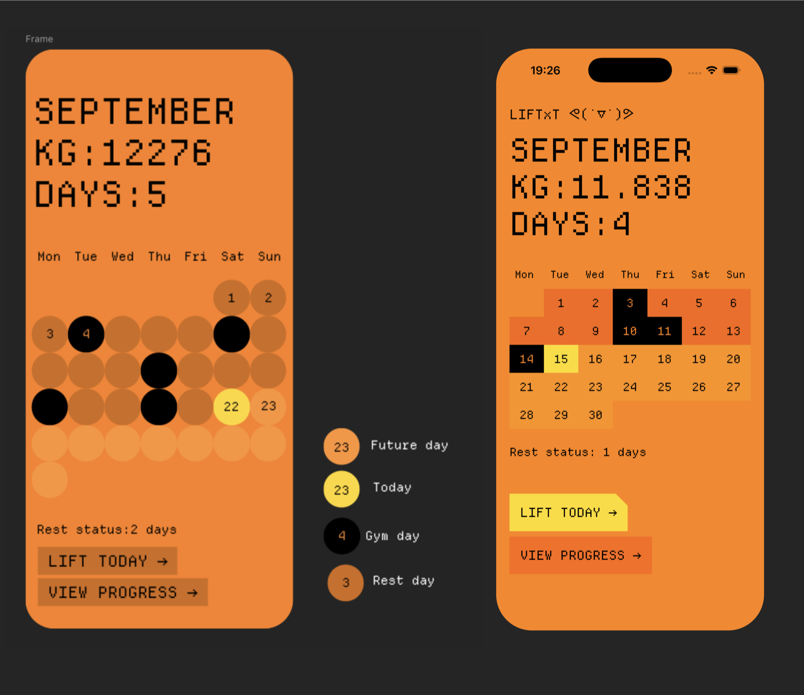
One thing I hadn’t planned for: the saturated yellows and oranges that looked great on my Mac looked noticeably duller once they were actually running on a phone screen. You don’t find that out until you’re testing on real hardware instead of staring at a design tool, so the whole palette got rebuilt in Display P3 instead of standard sRGB. Small thing. The kind of thing you only learn by shipping it to an actual device.
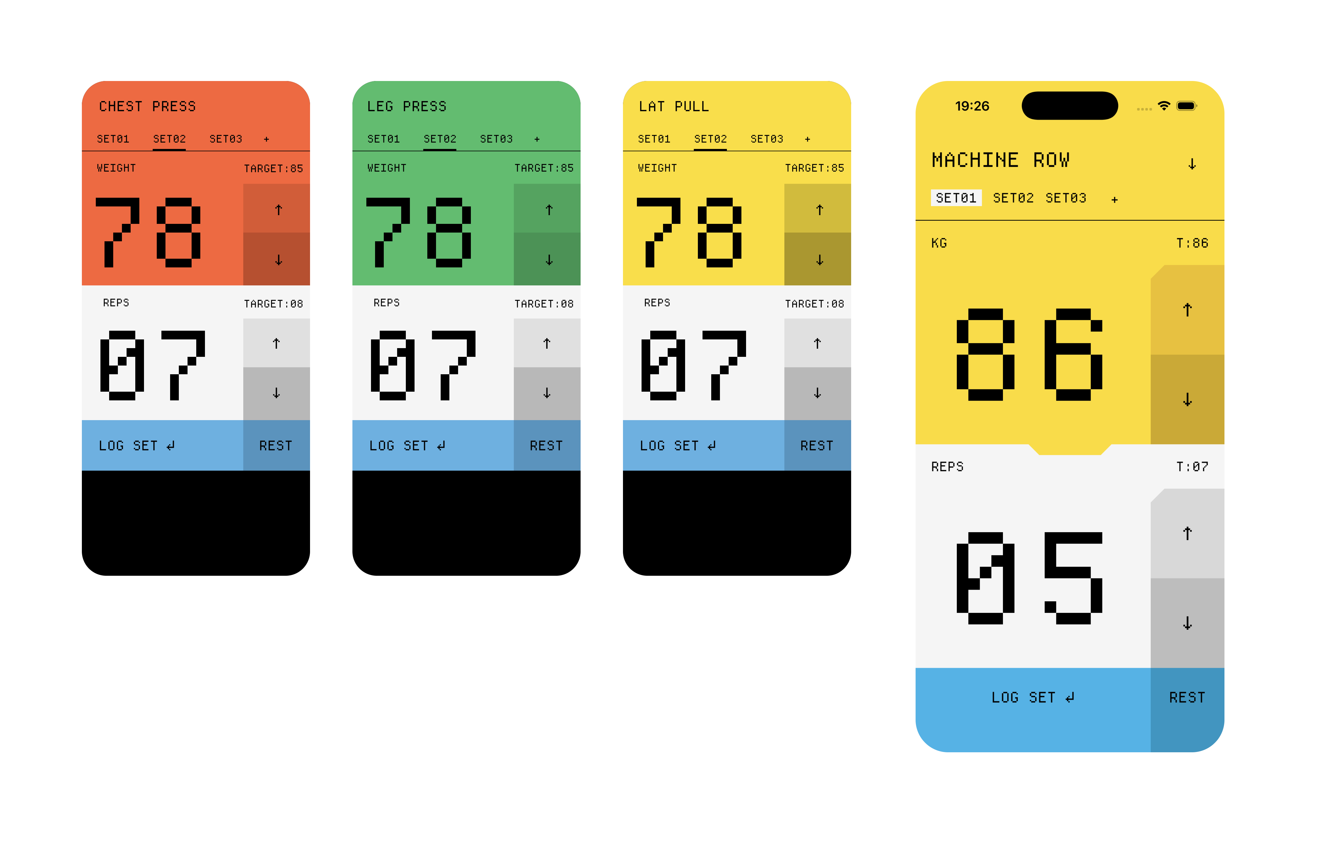
The number I’m meant to read from arm’s length without glasses sits at 165 points, zero-padded, so “6” is always “06” and never quietly changes width mid-set. Each of the three movement categories, push, pull, legs, gets its own saturated color, used consistently everywhere so the color itself becomes information instead of decoration. Rest gets its own distinct blue, deliberately different from all three, so its meaning (“you’re resting, not lifting”) never gets confused with an exercise’s identity.
Decisions I only made by actually lifting
A few of the app’s better decisions didn’t come out of planning at all. They came from using the thing.
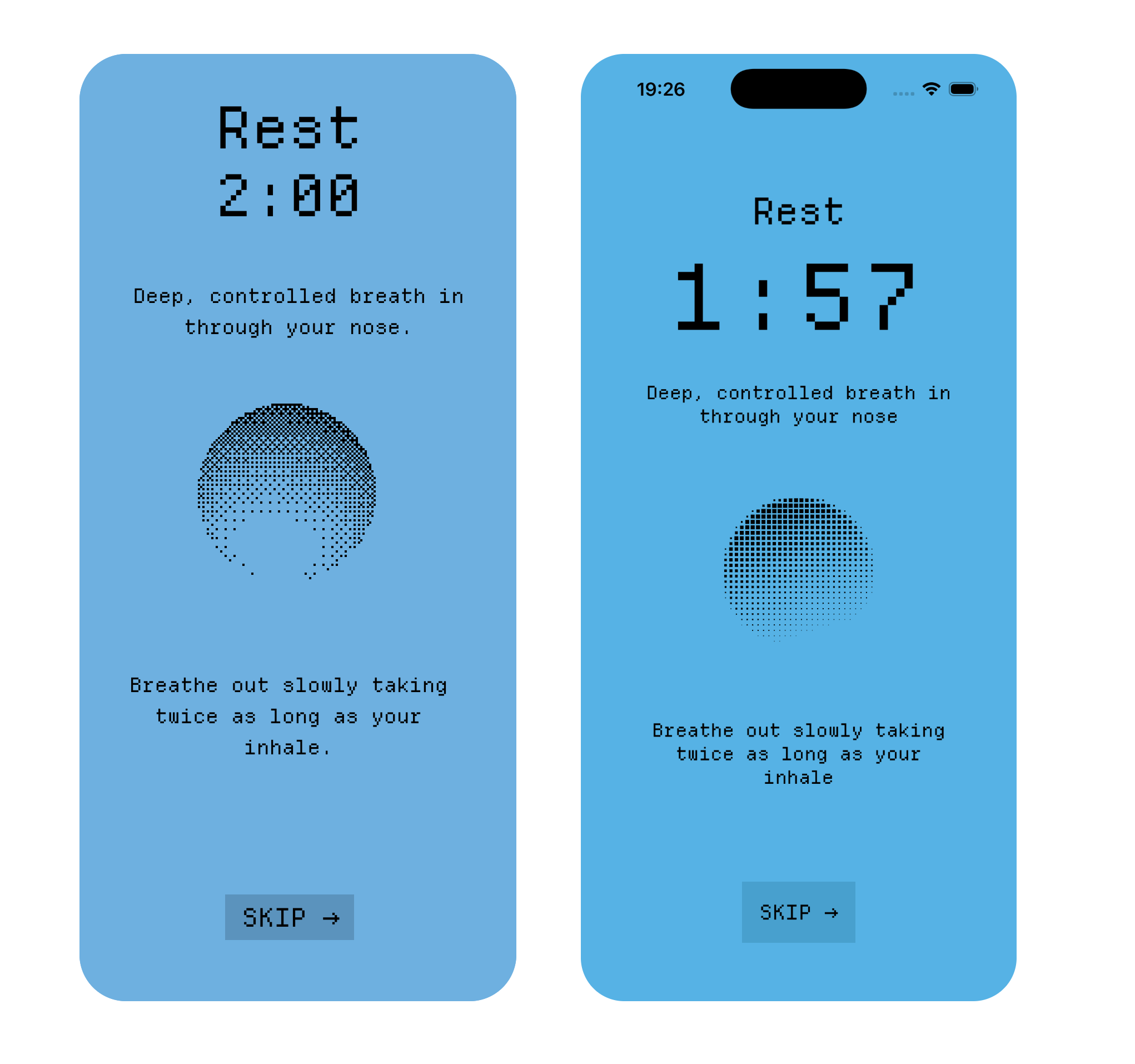
The rest-timer animation was supposed to deliberately not sync to breathing, on the theory that pacing someone’s breath from a phone screen is presumptuous. Looked fine in a preview. Felt wrong the first time I actually sat there resting between sets, a pulsing shape with no relationship to the exhale I was doing just read as noise, motion with no meaning. Matched to a slow inhale-hold-exhale cadence, the same animation instantly became something worth looking at. I ripped out the “principled” version and put in the one that just breathes with you.
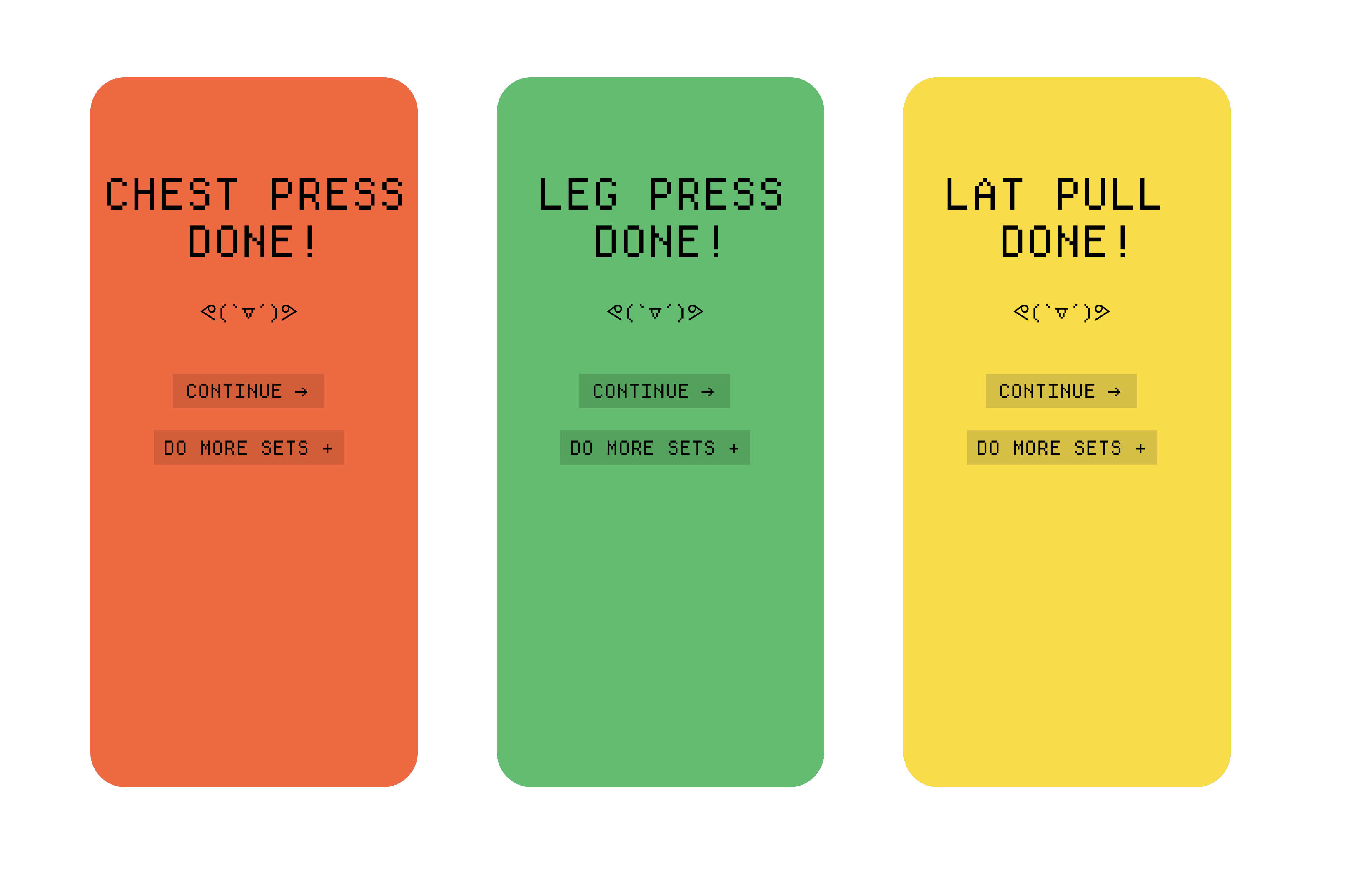
Finishing an exercise needed its own moment, too. My original plan deliberately avoided any special-casing of “this was the last set,” on the logic that every set-then-rest cycle should behave identically, no exceptions. After actually finishing an exercise in the gym, that felt wrong. There was no moment of “done,” just silence. So a small completion screen got added, “EXERCISE DONE,” with the choice to move on or add another set. Logically tidy on paper, unsatisfying in a gym, and the gym won.
And I tried, twice, to represent a logged set with a small checkmark icon. Twice I ripped it out. A tiny checkmark is exactly the kind of detail presbyopia eats alive, which is a little embarrassing for an app whose entire reason for existing is “can you read this without glasses.” What stuck was dumber and better: a logged set gets a solid color fill on its own tab. No icon to squint at, just a color you either see or don’t.
One more, quickly: tapping into a day, then an exercise, then a set, is built to feel like the thing you tapped expanding to fill the screen, not a push to a new one. iOS 18 has a native API for exactly that. My phone runs iOS 17, and I wanted to use this thing in the gym now, not in a few weeks once a new phone arrives, so the same effect got hand-built instead. More tuning than the native version would’ve needed. Works today, on the phone in my pocket, which is the only version of “works” that actually matters.
Feedback you don’t have to look at
Once the core loop was solid, the next round of decisions were about the same original constraint, legibility without close attention, just applied to touch instead of sight.
Logging a set triggers a distinct, confident haptic, different from the light tap used for smaller adjustments like the weight and rep steppers, or from opening and closing a screen. Each interaction uses a different haptic pattern from Apple’s feedback API depending on its weight: a stepper adjustment gets a light impact, logging a set gets a stronger notification-style haptic that reads as an actual confirmation, and finishing an exercise entirely gets its own separate, more emphatic pattern on top of that. Rest ending naturally triggers a different haptic than manually skipping it, since that’s a moment you might not be looking at the phone for at all.
None of this changes what the app does. It just makes the app legible through a channel that doesn’t need reading glasses, screen brightness, or even a glance at the phone.
Solving the lock screen problem
The most recent addition solves a small, real annoyance: checking the target before a set, setting the phone down in a gym phone holder, then wanting to glance at that number again a minute later, except the phone’s locked now, and getting back to it means picking it up, unlocking it, and re-finding the same screen for one number that was already sitting there a moment ago.
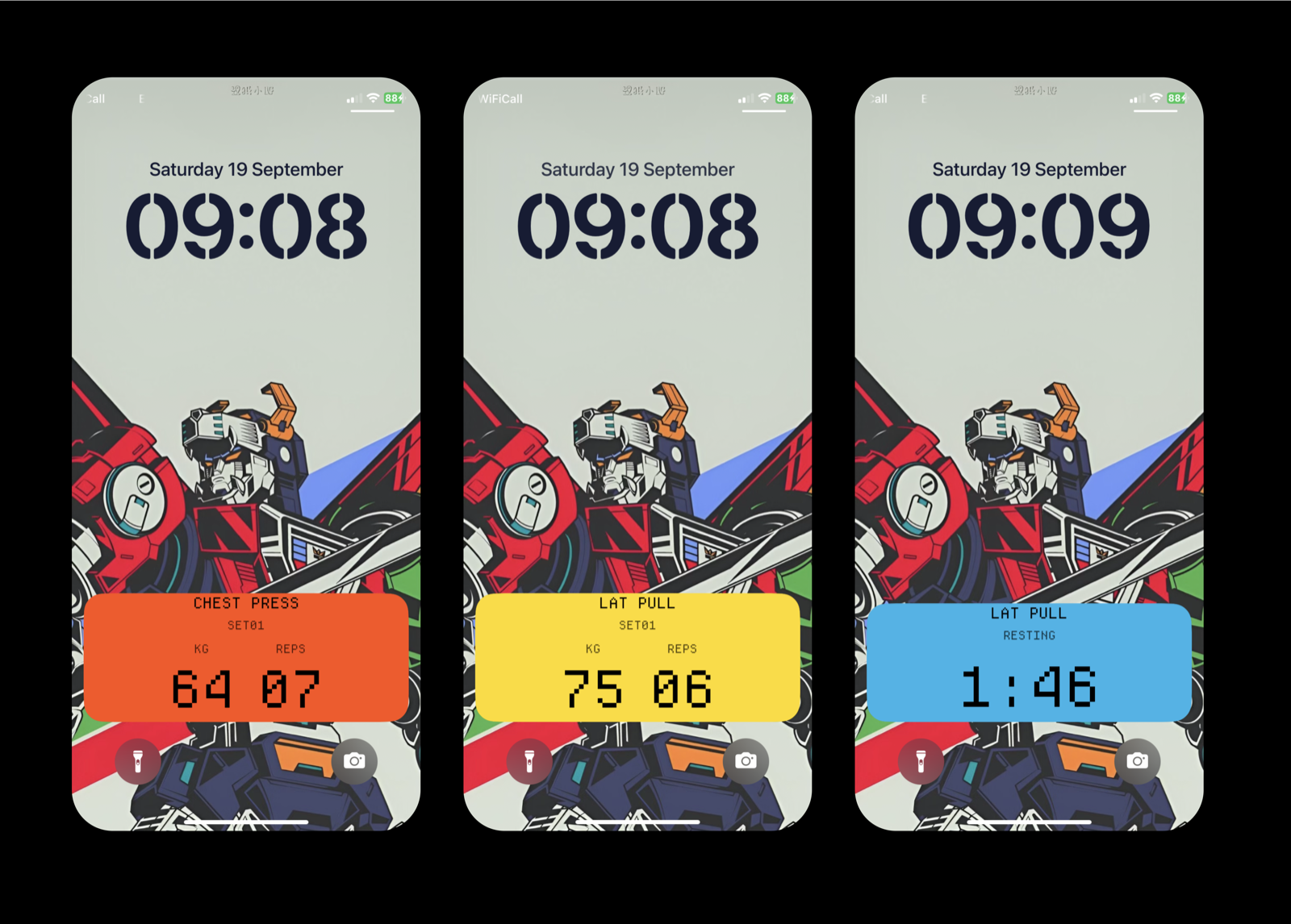
The fix uses Apple’s Live Activities, the same system behind a live delivery-tracking banner or a sports score sitting on the lock screen, updating without ever needing to be opened. LIFTxT now puts one up the moment an exercise screen opens: the current set’s target weight and reps, big and centered, visible at a glance on a locked screen. When rest kicks in, that same banner switches to a live countdown, so the rest timer’s visible without unlocking the phone either.
Getting it working turned into one of the more interesting debugging stretches of the whole project. The code was correct, the activity was being created and updated and logged, and yet nothing ever appeared. Turned out the real cause had nothing to do with Live Activities at all: a newly added part of the project had quietly inherited a far newer minimum iOS version than the rest of the app, so the phone I was testing on didn’t qualify to run it, and iOS fails that kind of mismatch completely silently, no error, no clue.
It looked like a bug in a fancy new API. It was one mismatched number in a build setting.
Fix was one line, once I stopped trusting “it should work” and went looking for actual evidence instead.
What’s next
The app is still built around exactly eight exercises, hardcoded, because that’s the actual routine I’m training. Turning that into something that handles someone else’s routine is real work, and I’m deliberately holding off on it. Building it now, before the current shape’s proven itself over months of real training data, would mean guessing at requirements instead of learning them. The progression logic especially, the +2.5kg / hold / −5kg rule, is only worth trusting once there’s enough real history to say whether it behaves the way it’s meant to over dozens of sessions, not just in theory.
For now, it does the one job it was built for: get out of the way, show me the number that matters, and get that number right often enough that I stop double-checking it. Which, for an app that started life as “please just let me read this without my glasses,” is about as happy an ending as I could’ve asked for.