Building in public (and learning along the way)
 (My portfolio over the years)
One of my goals for 2026 was to redesign my website. Not just visually. I wanted to rethink what it was actually for.
tinybigstudio.com (my previous site) was built around me as a service provider: product and web design, available for hire. This new one is something different, more about me as a professional and less about selling a service. A place to think out loud, share what I’m working on, and practice.
I also wanted to use this as an excuse to get back up to speed with modern web development. I’ve done HTML and CSS before, built WordPress sites, even used a PHP-based CMS called Kirby for my old site, but I let it go rusty. The workflow I knew felt dated, and I was curious about how things worked now. GitHub, Vercel, deployment pipelines, the whole thing.
So I set some constraints. I wanted something simple, cheap, and maintainable. Kirby was fine, but running a PHP CMS felt like more overhead than I needed. I landed on Astro, a framework designed specifically for content-focused websites. It generates plain HTML files that load fast and cost almost nothing to host. No database, no server to maintain, just files. It suited me perfectly.
Learning with Claude
I’d been playing around with Claude for a while, but this project gave me a real reason to use it properly. Instead of just asking it to write code for me, I used it more like a mentor. I’d ask questions, try to understand how things worked, then build it myself. Or at least attempt to.
That distinction matters. I didn’t want AI to just do it for me. I wanted to understand it. There’s a difference between having a working website and knowing why it works. I wanted both.
Claude helped me plan the whole thing: the learning path, the setup, the decisions. We worked through Git, GitHub, Vercel, Astro’s component model, Tailwind, all of it step by step, with the “why” explained before the “how.” I use Cursor as my IDE, which also has AI built in for code completion. The combination is genuinely impressive.
The site is based on a template by Max Petretta, clean, minimal, exactly what I was after. Props to him for making it open source.
The writing problem
One thing I’ve always struggled with is actually sitting down and writing. I have thoughts, I have things I want to share, but the blank page kills the momentum.
So I went looking for a better way. What I’ve landed on: I record my rambling, like I’m doing right now. Then I clean it up as a first draft with Claude, then take it from there. It removes the friction of getting words on a page. The ideas are still mine. It’s just a different way in.
I’m also using Obsidian to organise drafts and notes. I hadn’t used it before but I’m curious about it, and it integrates well with AI tools since everything is markdown, which makes it easy for Claude to read and work with.
On designers and curiosity
I’ve been a designer long enough to know that the best ones I’ve worked with aren’t specialists in the narrow sense. They’re curious. They poke at things outside their immediate remit. They want to understand how the whole thing fits together, not just their slice of it.
I think that applies to technology too. You don’t need to become a developer. You don’t need to understand every line of code. But having a working sense of how the tools around you function, what a deployment pipeline does, why a static site is different from a server-rendered one, that changes how you think and collaborate. It makes you less dependent on others for decisions that affect your work. It makes you a better partner to the people building the things you design.
We’re at a moment where the barrier to exploring this stuff has dropped dramatically. AI tools mean you can ask questions and get real answers, not just documentation. You can build something, break it, understand why it broke, and fix it, all in an afternoon. Curiosity has always been a design skill. Right now it’s a particularly useful one.
An example of playing around with Claude Code was to avoid with this site feeling too sterile. Minimal doesn’t have to mean cold. So I added an animated dot matrix as the background, a subtle animated pattern that slowly shifts colour across the page. It sounds simple but getting it to feel right took a few iterations. I worked through prompting, describing what I wanted and tweaking myself until it landed somewhere I was happy with. That back and forth, having a clear idea in your head and then refining until the output matches is something I’ve started to enjoy about working this way.
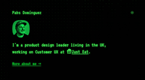
The other thing I added was a CRT mode. It lives with the dark/light mode toggle, and when you switch it on, the whole site transforms: phosphor green, monospace font, the kind of glow you’d expect from a monitor that predates most people reading this. It’s an easter egg more than anything. The site is intentionally serious and minimal, so having this hidden in the corner felt like the right way to let some personality through without it taking over. Again, built through a series of prompts and adjustments. I’m genuinely surprised by what’s achievable when you have a clear picture of what you’re after and you’re willing to iterate.
Still in progress
The site is live but very much a work in progress. I still want to connect a CMS. I’ve been looking at Sveltia, which is a free, open source, Git-based headless CMS and feels appropriately lightweight. I also have some side project ideas I want to build out and put on here. Small experiments, things I’ve built with AI just to see if I could. Let’s see where that goes.
We’re in an interesting moment. If you spend too long reading takes about the future of design or AI, it’s easy to spiral. But if you stay curious and actually put things into action, it feels fine. Exciting, even.
Stay curious. Tinker. Use the tools that exist. Understand what they’re doing.
More soon. Hopefully not once every five years this time.